Updating site CSS
Old Website
The old website's CSS was based on Bootstrap, with some custom styling. Source code can be found here. The code itself was hacked together.
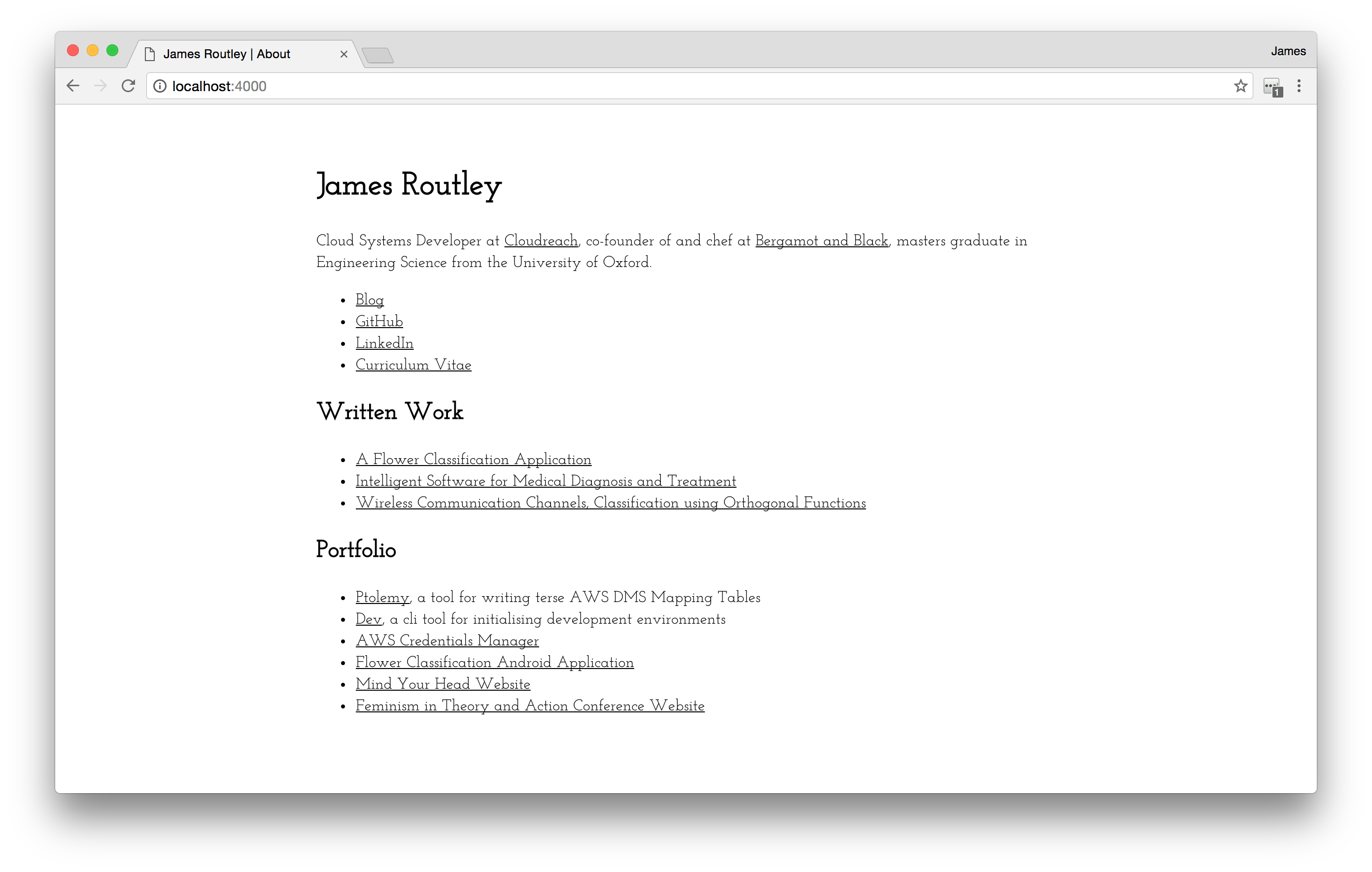
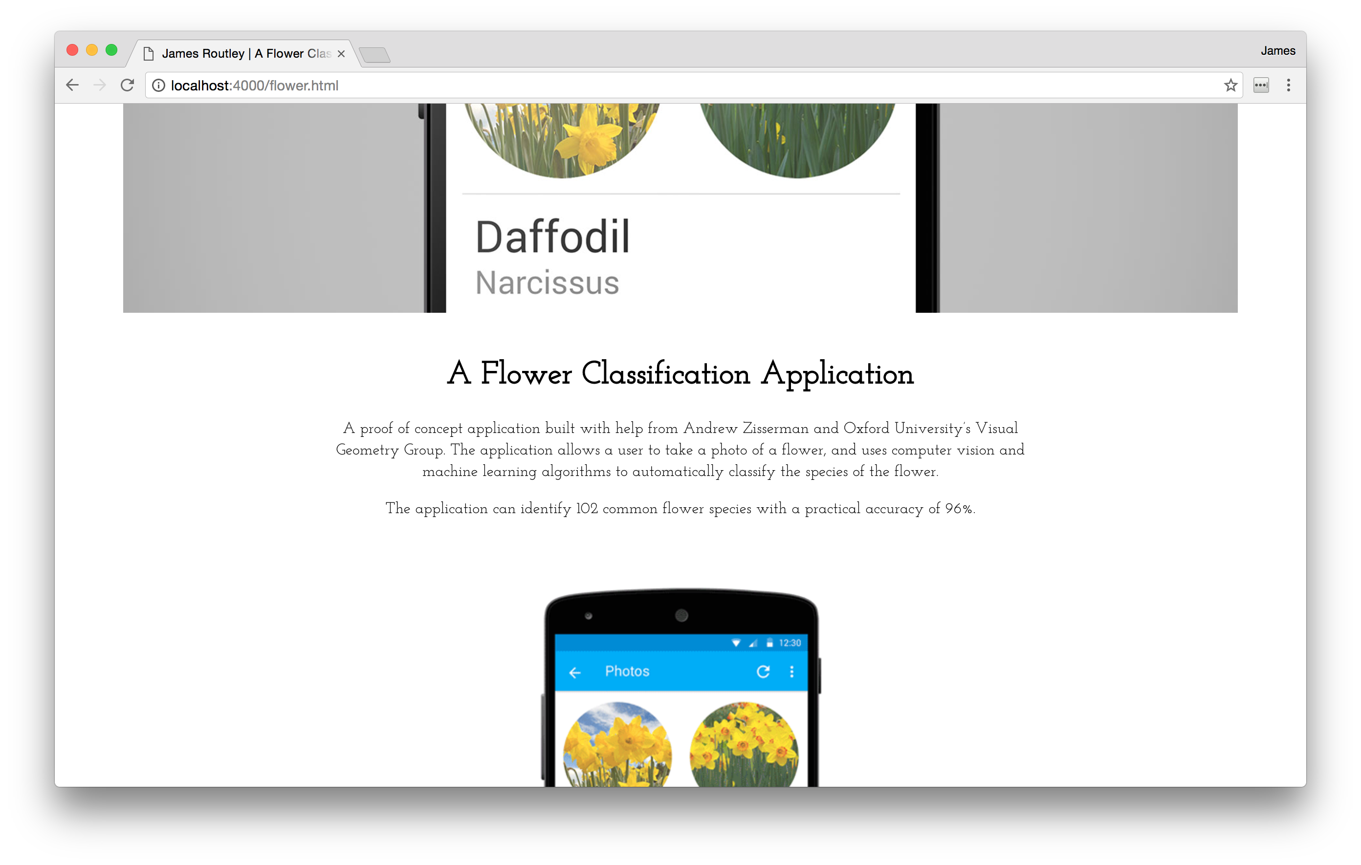
The font is Josefin Slab, which I quite liked for the main page, but I thought it felt too affected for use as the main font for blog posts.
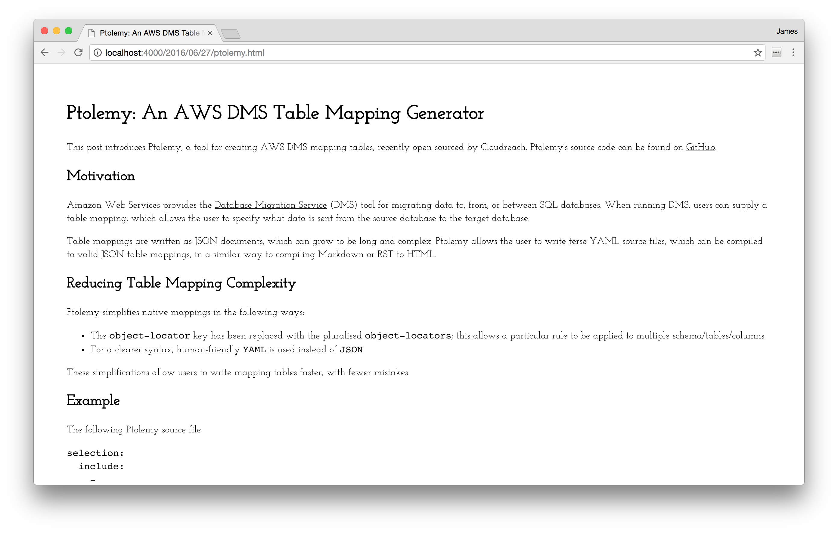
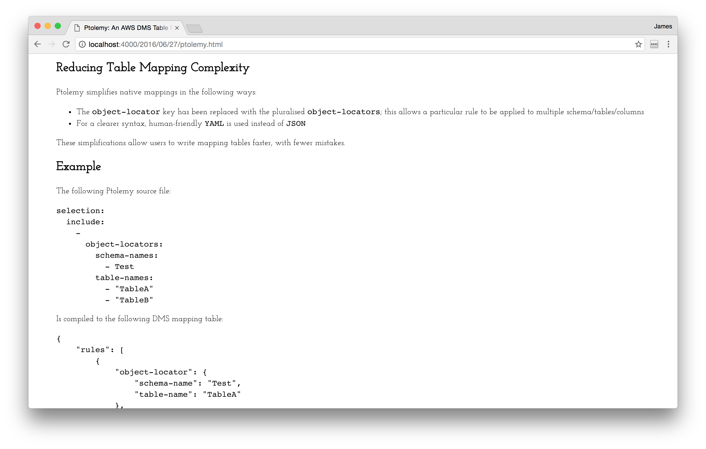
There are issues with the font size of the monospace font used for code blocks.
New Website
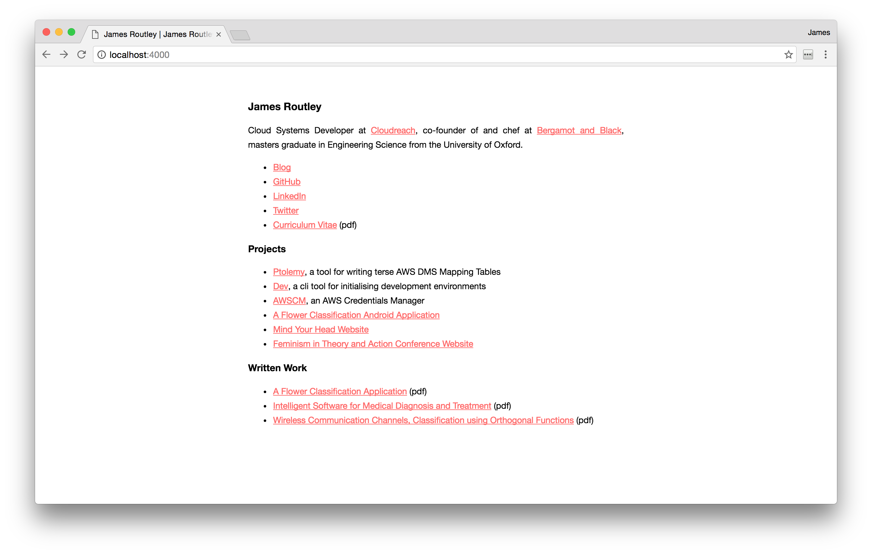
The new website takes a minimalist approach to CSS, using system defaults where possible. The full code is 67 lines long, including whitespace and comments, and can be found here.
Font
Josefin Slab has been replaced by the user's system font, for speed and a native
feel. More information about using system fonts in web design can be found in
this
post.
The font-family used here is the same as the one used by GitHub for Markdown
text formatting.
body {
  font-family: -apple-system, BlinkMacSystemFont, "Segoe UI", Helvetica, Arial,
    sans-serif, "Apple Color Emoji", "Segoe UI Emoji", "Segoe UI Symbol";
}
Alignment
The new site removes the Bootstrap dependency. Previously, the content was
centered by offsetting grid columns. Centre alignment is now implemented by
setting margin-left and margin-right of the main div to auto. Setting
max-width rather than width scales down the size of the div if screen size
is less than 600px.
.main {
  max-width: 600px;
  margin: 50px auto 50px;
}
Responsive Images
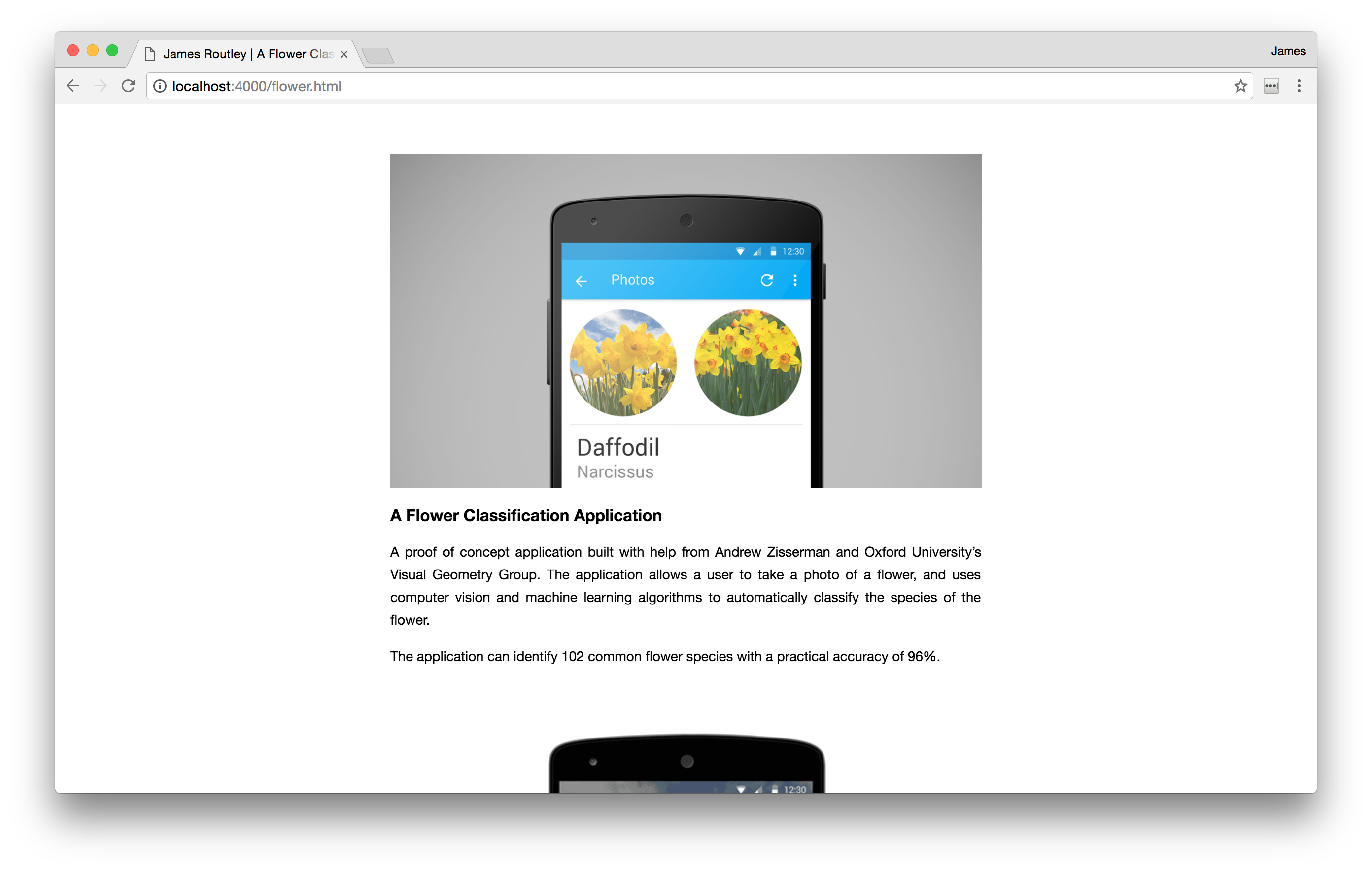
Bootstrap-style responsive images can be acomplished with the following code:
img {
  display: block;
  max-width: 100%;
  height: auto;
  margin: auto;
}
All pages in the new website are compiled from Markdown. Attaching classes to
the generated HTML elements is possible, but requires HTML to be explicitly
written into the Markdown. Applying CSS to the HTML element itself (rather
than a class each image is assigned to) feels like bad practice, but I chose it
over having to add classes manually.
Code Blocks
Code blocks are again inspired by GitHub's Markdown rendering, borrowing their
background-color and border-radius.
code,
pre {
  font-size: 0.95em;
  font-family: Consolas, "Liberation Mono", Menlo, Courier, monospace;
  background-color: #f7f7f7;
  border-radius: 4px;
}

pre {
  padding: 1.2em;
}
Hyperlinks
Hyperlink styling introduces the only colour in the website.
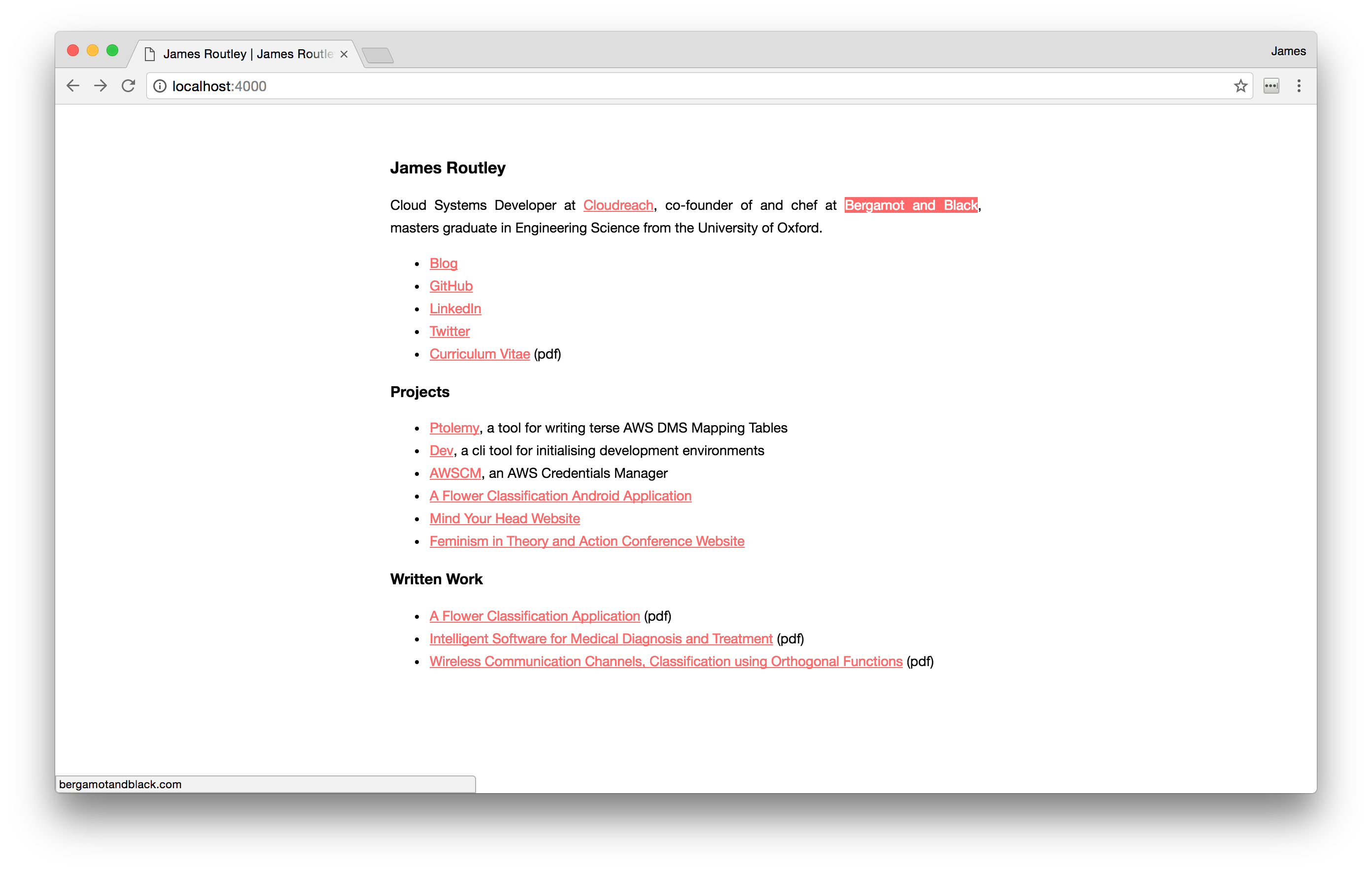
a:link {
  color: #ff6868;
  text-decoration: underline;
}

a:visited {
  color: #ff6868;
}

a:hover {
  color: white;
  background-color: #ff6868;
  text-decoration: none;
}
The a:hover styling is used to 'highlight' hyperlinks when the user hovers
over them, an idea borrowed from Hack CSS.